

New market conditions brought about by NDIS have handed the power to consumers, giving them more say in the care and services they access, how these are delivered to them, and who delivers them. That means, service providers have to step up. Not just in the actual services they offer, but how they communicate and market them too.
As a User Experience (UX) agency that specialises in the NDIS sector, Yump has helped many providers – such as MacKillop Family Services, Autism Spectrum Australia and Expression Australia – improve their website UX, streamline access to services, increase their reputation and overall become more competitive in engaging prospective clients.
We conducted a best-practice review among disability service providers, including NDIS-registered providers and disruptors, to learn about the opportunities and benefits of offering a more comprehensive and more technologically-advanced service.
Here are our top 5 tips to help you meet new user expectations and drive NDIS-related enquiries.
1. Stay on top of the accessibility game
For NDIS providers, we’d usually assume their websites are WCAG compliant, meaning their website is accessible by everyone, including those with a lived experience of disability. But outside the scope of WCAG compliance, there are other ways that organisations can make their site accessible. Such as:
Using illustrations over wordy-explanations
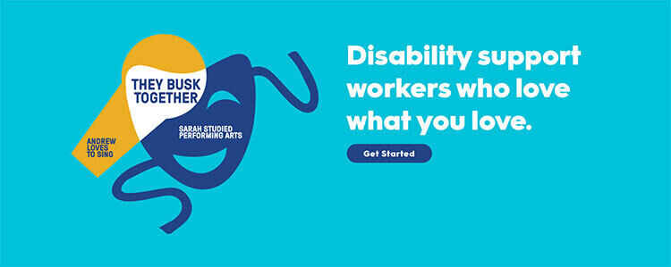
It can be hard to describe a concept with just words, especially if it requires abstract thinking. That’s where design comes in. For example, Hireup uses illustrations to demonstrate how people with a disability can find a support worker who shares their interests. With copy and design working together, the message is easily understood at a glance, and much more compelling.
Offer clear Call to Actions (CTA) above the fold
Some users can find it hard to understand simple, conversational language, which is why offering a clear Call to Action high up on the page is beneficial and often leads to higher engagement or conversion. For example, Specsavers placed a ‘Book an appointment’ CTA right below their intro copy.
Speak your user’s language
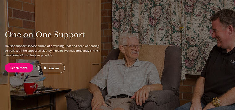
Auslan is the language of the deaf community in Australia. Deaf Services offers key content such as services both written (text) and in Auslan, the language of the deaf community in Australia. Auslan is communicated by video, and the button makes this clear by using the play symbol.
2. Offer NDIS-specific content
When it comes to consumer-centred models of service provision, educating both clients and support professionals on their choices is key. While it might not be your role to educate clients on NDIS, you should consider including helpful information about NDIS on your website because it not only helps build trust, but users are always looking for it.
Client acquisition through NDIS information
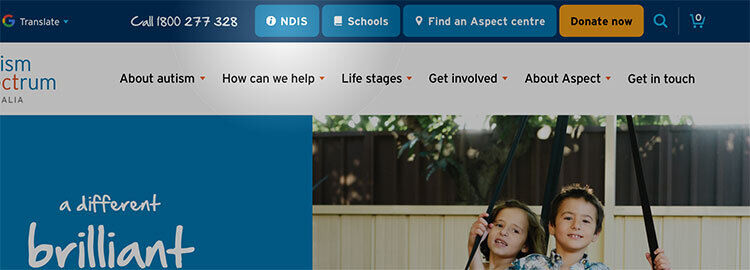
Different clients have a varying understanding of the NDIS and how it impacts them. They want to see helpful information around NDIS planning meetings, where local NDIS offices are, why they don’t have NDIS and whether they are eligible for it. The best thing you can do is make this information easily accessible, just like how Autism Spectrum Australia does on their landing page.
Use FAQs to make NDIS information easily accessible
It can be quite daunting to understand the NDIS journey from start to finish. To overcome this, Gellibrand uses a FAQ page to present information simply and clearly. Users control how much content they see at a time, by what’s relevant to them.
Keeping up with ever-changing NDIS content
To save time creating, updating and managing content about the NDIS, simply connect prospective non-NDIS clients with the Government’s NDIS site. Various NDIS providers have published a link specifically to the Access Checklist. That means prospective clients can easily check their eligibility for the NDIS and make an access request. Once they are found eligible, it will be easier for them to determine whether your services are relevant to their needs.
3. Outline the full scope of your services
By categorising and grouping information together, and highlighting them on key landing pages will help users quickly find what they are looking for. This approach also helps users who may not know exactly what they’re looking for, self-identify their needs. Just keep in mind that this kind of audience-based navigation works best when each audience group’s content is unique, otherwise users find themselves ping-ponging between groups.
Group services by life stage
The Government of Western Australia, Department of Communities Disability Services uses life stages to categorise and group information, allowing users to self-identify and find the information relevant to them.
Use subcategories to create scannable shortcuts
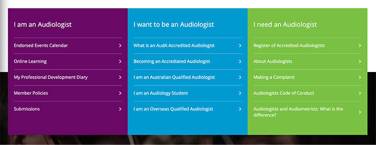
Audiology Australia uses a mega menu-like design that allows users to see the scope of each audience section before getting too deep, and links directly to those topics. This way, users can scan their options without wasting time on information that isn’t relevant to them.
Use clear and easily identifiable keywords
Referrers play a critical role in clients choosing a service provider. Catering to them as a key target audience can help improve conversion. Often, they’re looking for keywords related to the service or program to quickly identify whether their potential client is a relevant prospect. More in-depth or specific information is better kept on a service detail page.
4. Help users make decisions quickly
With so many options to choose from, users can become exhausted. To avoid decision fatigue, deliver your services and programs in the smartest way possible – such as filters to narrow down high volumes of content
Consider location-filtering by suburb, postcode or town
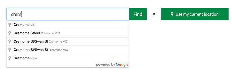
When services are offered in multiple locations state or country-wide, location-filtering becomes a great way for users to find relevant information quickly. Specsavers offers a store-finder powered by Google that uses auto-completion so that users can quickly find their nearest store with minimal effort.
Offer guided search to help engage and convert
Guided search is a great tool for users who are not sure what services fit their situation and needs. Carer Gateway’s guided questionnaire is designed to connect the user with content and services that matches their situation and caring needs.
Opt for instant filtering
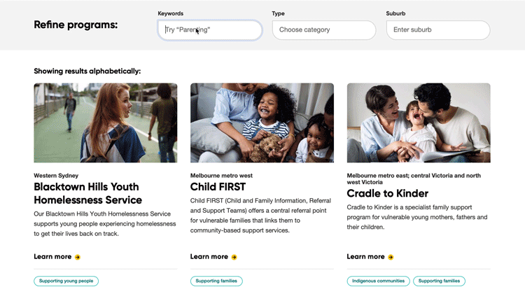
Live filters can promote serendipity and save time – even if the user hasn’t finished entering a specific word, the keyword results shown will likely be useful. In the example shown, MacKillop Family Services, guides a referral looking for foster care programs through relevant live filtering.
5. Tell compelling stories
To support their strategies, NDIS providers should use real-life examples and storytelling to help break down complex information and establish credibility. Showcasing valuable stories helps to further build trust with prospective clients, and thus improve conversion. It’s not about going overboard with emotion but rather using anecdotal, engaging and genuine stories as social proof.
Support your stories with images and video content
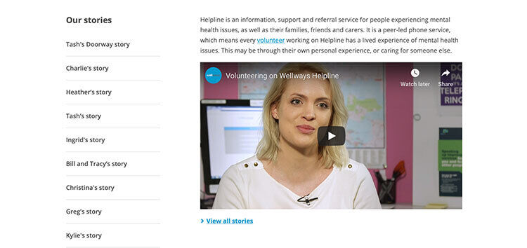
Wellways use storytelling to give prospective volunteers a real look into what it’s like to be a volunteer for them. Using images and video interviews, as opposed to just written testimonials, makes the content more engaging, more genuine and therefore gives their organisation and volunteering program more credibility.
Engage users in conversations about the NDIS
Some people may feel overwhelmed by large volumes of written text. One way to overcome this is to include them in the conversation. For example, Deaf Society engages users in conversations about the NDIS by featuring stories about people’s personal experiences with the NDIS.
Use case studies to highlight results
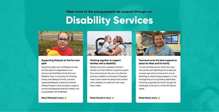
Case studies are a great way to showcase results from the perspective of your audience. By featuring stories from users who have overcome pain points, helps to build equity in your organisation’s claims and services and adds value to your reach. For example, MacKillop Family Services features stories from multiple people from diverse demographics and backgrounds.
About the Authors
Yump is an award-winning digital agency that specialises in user experience and website transformation for not-for-profits. We help cause-based organisations dramatically increase user engagement and reduce website management time. Speak to us today about how we can help you.